
Pxless Design: Complete Guide to Scalable, Adaptive, Future-Ready UI Systems
Introduction
The rapid expansion of digital devices, screen sizes, and user expectations has fundamentally changed how interfaces are designed and experienced. Traditional pixel-based systems, once considered reliable, now struggle to deliver consistency across modern platforms. This shift has led to the emergence of Pxless, a flexible design philosophy that replaces rigid pixel measurements with scalable, adaptive units. Rather than forcing layouts into fixed dimensions, Pxless enables interfaces to respond intelligently to their environment, ensuring smoother usability, better accessibility, and long-term scalability. This guide explores every essential aspect of this approach, offering deep insights into how it works, why it matters, and how it is shaping the future of digital design.
Table of Contents
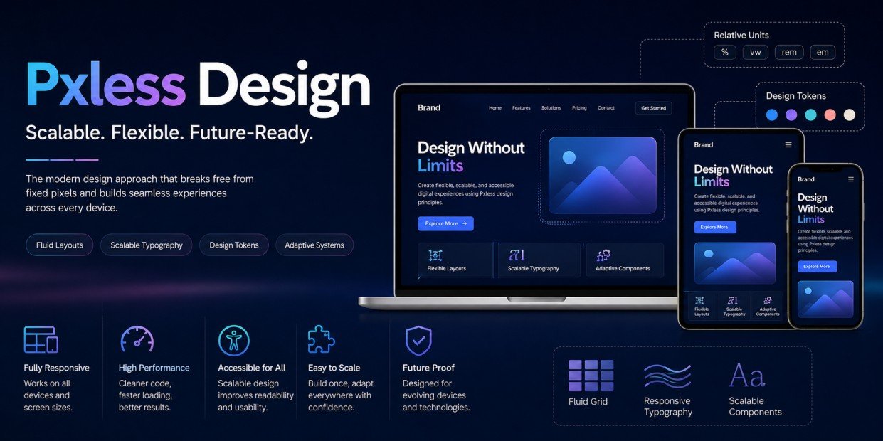
ToggleQuick Overview of Pxless Design
| Aspect | Details |
|---|---|
| Concept | Flexible, scalable design without fixed pixel dependency |
| Core Idea | Use relative units and adaptive systems |
| Goal | Seamless experience across all devices |
| Key Elements | Fluid layouts, scalable typography, design tokens |
| Advantages | Performance, accessibility, scalability |
| Usage | Web apps, mobile interfaces, dashboards |
| Future | AI-driven adaptive design ecosystems |
Meaning and Evolution of Modern Flexible Design Systems
The concept behind Pxless design originates from the limitations of pixel-perfect layouts. In earlier stages of web development, designers relied heavily on fixed values because screen sizes were predictable. As technology advanced, this approach began to fail due to the diversity of devices, including smartphones, tablets, large monitors, and even foldable screens.
Over time, the industry shifted toward responsive design, which introduced breakpoints to handle different screen sizes. However, this was still not fully efficient because layouts would “jump” between fixed states. The modern approach evolved further into fluid systems, where proportions matter more than exact values. This is where Pxless became a complete philosophy rather than just a technique, focusing on adaptability, context awareness, and seamless scaling.
Foundational Principles That Drive Adaptive Layouts
The foundation of Pxless lies in flexibility and proportional thinking. Instead of assigning exact pixel values, designers use relative units such as percentages, viewport dimensions, and scalable font units. This ensures that elements adjust naturally based on their container or screen size.
Another important principle is consistency through systems. Design tokens and reusable components allow teams to maintain a unified visual identity while still supporting flexibility. Modularity also plays a key role, enabling components to function independently without breaking the overall layout. These principles together create a system that is both structured and adaptable.
Deep Benefits for Performance, Flexibility, and User Experience
One of the strongest advantages of Pxless design is its ability to create a consistent experience across all devices. Users no longer encounter awkward layout shifts or mismatched proportions when switching screens. Instead, the interface adapts smoothly, maintaining usability and visual balance.
Performance improvements are another major benefit. Flexible systems reduce the need for excessive media queries and redundant styling, resulting in cleaner and more efficient code. This directly impacts loading speed and responsiveness. From a user experience perspective, adaptability ensures that content remains readable and accessible, regardless of device or user preferences.
SEO, Accessibility, and Speed Optimization Advantages
Modern search engines prioritize websites that offer fast, mobile-friendly, and accessible experiences. Pxless design naturally supports these requirements by enabling lightweight layouts that perform well across different environments.
Accessibility is enhanced through scalable typography and adaptable spacing, allowing users to customize their viewing experience without breaking the design. This is especially important for users with visual impairments or specific accessibility needs. Speed optimization also becomes easier, as flexible layouts reduce unnecessary complexity and improve rendering efficiency.
Responsive Design Evolved into Fluid Systems
Responsive design introduced the idea of adapting layouts using breakpoints, but Pxless takes this concept further by eliminating rigid transitions. Instead of switching between predefined layouts, fluid systems allow elements to scale continuously.
This approach creates a more natural experience, where content flows smoothly regardless of screen size. Fluid grids, flexible containers, and adaptive media elements work together to maintain balance and structure. The result is a design that feels intuitive and consistent, rather than forced into fixed patterns.
Advanced Typography and Scalable Visual Hierarchy
Typography is a critical element in any design system, and Pxless enhances it by making it fully scalable. Using relative units ensures that text adjusts proportionally, maintaining readability across all devices.
A well-structured visual hierarchy is also easier to achieve with scalable typography. Headings, paragraphs, and interactive elements can adapt without losing their importance or clarity. This creates a more cohesive reading experience and ensures that users can easily navigate content.
Role of Design Systems and Token-Based Architecture
Design systems are essential for implementing Pxless effectively. They provide a structured framework that ensures consistency while allowing flexibility. Tokens play a central role by defining reusable values for spacing, colors, typography, and other design elements.
By using tokens, teams can update designs globally without rewriting code. This not only saves time but also reduces the risk of inconsistencies. Token-based architecture supports scalability, making it easier to expand or modify systems as projects grow.
Implementation Strategy for Modern Teams
Adopting Pxless design requires a strategic approach. Teams must transition from fixed layouts to flexible systems gradually, starting with typography and spacing before moving to full layout structures.
Developers need to focus on relative units and fluid grids, while designers must create adaptable components. Collaboration between both roles is essential to ensure that designs are implemented correctly. Testing across multiple devices is also crucial to validate the effectiveness of the system.
Developer Collaboration and Workflow Efficiency
Collaboration between designers and developers becomes more important when working with Pxless systems. Clear communication ensures that design intentions are accurately translated into code.
Modern workflows often integrate design tools with development frameworks, enabling real-time updates and consistency. This reduces errors and improves efficiency. Shared design systems and documentation further streamline the process, allowing teams to work more effectively.
Real-World Applications and Industry Use Cases
Many modern platforms have adopted Pxless principles to handle complex and large-scale interfaces. Applications such as dashboards, content platforms, and enterprise systems benefit greatly from flexible layouts.
In real-world scenarios, this approach reduces layout issues and simplifies maintenance. Teams can adapt to new requirements without redesigning entire systems. This makes Pxless a practical solution for businesses aiming to stay competitive in a fast-changing digital environment.
Tools, Frameworks, and Technical Ecosystem
A variety of tools support the implementation of Pxless design. Modern CSS features, design software, and development frameworks all contribute to building flexible systems.
These tools enable designers and developers to create scalable layouts with minimal effort. However, understanding how to use them effectively is essential. Proper training and experimentation can help teams fully leverage their capabilities.
Challenges, Limitations, and Practical Solutions
Despite its advantages, Pxless design comes with challenges. Transitioning from traditional systems can be difficult, especially for teams accustomed to pixel-based workflows. There may also be a learning curve when adopting new tools and techniques.
Solutions involve gradual implementation, starting with small changes and expanding over time. Documentation and team training are also important to ensure a smooth transition. With the right approach, these challenges can be effectively managed.
Testing Methods and Continuous Optimization
Testing plays a vital role in ensuring the success of Pxless design. Interfaces must be evaluated across different devices, screen sizes, and user conditions.
Continuous optimization is necessary to maintain performance and usability. By analyzing user behavior and feedback, teams can refine their systems and improve overall experience. This ongoing process ensures that designs remain effective and relevant.
User Experience and Visual Consistency
User experience is significantly improved with Pxless design, as interfaces adapt seamlessly to different contexts. This creates a more natural and intuitive interaction for users.
Visual consistency is maintained through scalable systems and design tokens. Even as layouts change, the overall look and feel remain cohesive. This balance between flexibility and consistency is key to delivering high-quality digital experiences.
Scalability, Maintenance, and Long-Term Growth
Scalability is one of the defining strengths of Pxless design. As new devices and technologies emerge, flexible systems can adapt without requiring major changes.
Maintenance becomes easier because updates can be applied globally through design tokens and reusable components. This reduces development time and ensures that systems remain efficient over the long term.
Future Trends and Innovation in Adaptive Design
The future of Pxless design is closely tied to advancements in technology. AI-driven interfaces and adaptive systems are expected to play a major role in shaping the next generation of digital experiences.
These innovations will allow designs to respond dynamically to user behavior, preferences, and environmental factors. As this evolution continues, Pxless will remain a key foundation for building flexible and intelligent systems.
Competitive Advantage in the Digital Era
Businesses that adopt Pxless design gain a significant edge in the digital marketplace. They can deliver consistent, high-quality experiences across all platforms, improving user satisfaction and engagement.
This approach also enables faster development cycles and easier updates, allowing organizations to respond quickly to changes. By focusing on flexibility and scalability, companies can build systems that remain competitive and future-ready.
Conclusion
Pxless design represents a transformative shift in how digital interfaces are created and maintained. By moving away from rigid pixel-based systems, it enables designers and developers to build flexible, scalable, and user-centric experiences. From improved performance and accessibility to long-term scalability and innovation, this approach addresses the challenges of modern digital environments. As technology continues to evolve, adopting Pxless is not just an option but a necessity for creating future-ready digital solutions.
FAQs
What does Pxless design mean?
It refers to a flexible design approach that avoids fixed pixel units and uses scalable measurements for adaptability.
Is Pxless better than traditional responsive design?
It enhances responsiveness by allowing smoother, continuous scaling instead of fixed breakpoints.
How does Pxless improve performance?
It reduces code complexity and improves loading speed through efficient, flexible layouts.
Can beginners implement Pxless design easily?
It may require learning new concepts, but gradual adoption makes it manageable.
Why is Pxless important for the future?
It supports evolving technologies and ensures designs remain adaptable across new devices.